CSS is a powerful tool for designing engaging and user-friendly interfaces. In this post, I’ll share 22 CSS tips that can help you enhance text styling, create smooth interactions, and fine-tune your UI design.
Let’s jump right into it!🚀
Create a Shadow Effect on Text
You can use the text-shadow property to create a shadow effect on text, creating depth and making the text more visually appealing.
Syntax:
text-shadow: h-shadow v-shadow blur-radius color;
- h-shadow: Horizontal shadow position (required).
- v-shadow: Vertical shadow position (required).
- blur-radius: Optional. Defines the blur distance. The higher the value, the more blurred the shadow becomes.
- color: Optional. Specifies the color of the shadow.
Example:
<!DOCTYPE html>
<html lang="en">
  <head>
    <meta charset="UTF-8" />
    <meta name="viewport" content="width=device-width, initial-scale=1.0" />
    <title>Text-Shadow Property</title>
    <style>
      h1 {
        text-shadow: 2px 2px 5px #585858;
      }
    </style>
  </head>
  <body>
    <h1>Text-Shadow</h1>
  </body>
</html>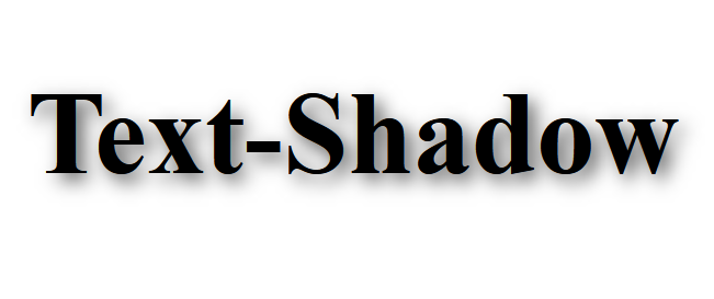
Change the Color of the First Letter of a Text
You can change the color of the first letter of a text using the ::first-letter pseudo-element.
This allows you to target and style just the first letter of any block of text, making it easy to apply a different color, font style, or size to it.
Example:
<!DOCTYPE html>
<html lang="en">
  <head>
    <meta charset="UTF-8" />
    <meta name="viewport" content="width=device-width, initial-scale=1.0" />
    <title>::first-letter Pseudo-Element</title>
    <style>
      p {
        font-size: 1em;
        font-weight: 500;
      }
      p::first-letter {
        color: #4763ff;
        font-size: 2em;
        font-weight: bold;
      }
    </style>
  </head>
  <body>
    <p>
      This is an example paragraph. The first letter will be colored
      differently.
    </p>
  </body>
</html>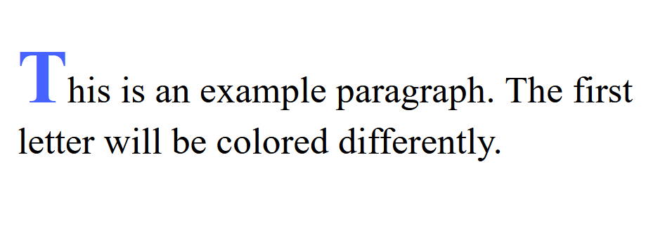
Add a Stroke to the Text
To add a stroke to text in CSS, you can use the -webkit-text-stroke property.
This property is supported in WebKit-based browsers like Chrome, Safari, and Edge. It allows you to apply a stroke effect to text, giving it an outlined appearance.
Syntax:
text-stroke: <stroke-width> <stroke-color>;
stroke-width: Defines the width of the stroke (outline).stroke-color: Defines the color of the stroke.
Example:
<!DOCTYPE html>
<html lang="en">
  <head>
    <meta charset="UTF-8" />
    <meta name="viewport" content="width=device-width, initial-scale=1.0" />
    <title>Text-Stroke</title>
    <style>
      h1 {
        color: rgb(148, 206, 240);
        -webkit-text-stroke: 2px rgb(77, 147, 187);
      }
    </style>
  </head>
  <body>
    <h1>Text-Stroke</h1>
  </body>
</html>
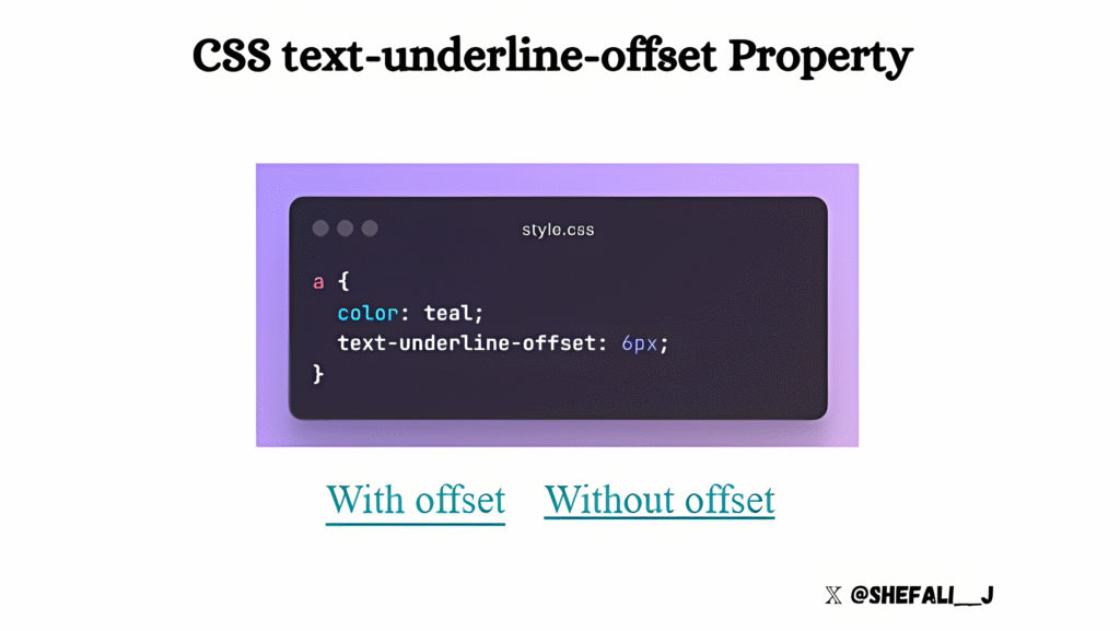
Control the Vertical Distance Between the Text and its Underline
You can use the text-underline-offset property to control the vertical distance between the text and its underline.
Syntax:
text-underline-offset: <length>;
<length>: This specifies the distance by which the underline should be offset. The value can be in units like pixels (px), ems (em), rems (rem), etc.
Controlling Text Justification
You can use the text-justify property to control how text is justified when the text-align property is set to justify.
This property provides different methods for adjusting the spacing between characters or words to ensure the text aligns evenly across the entire width of the container.
Syntax:
text-justify: <value>;
- auto: The default justification method. It determines how text is justified based on the font and context.
- inter-word: This adds space between words to justify the text, making the words more spaced out.
- inter-character: Adds space between individual characters to justify the text. This can lead to uneven spacing, especially if the text contains long words.
- none: Disables any justification and maintains the default spacing between words or characters.
- initial: Resets the value to the default setting.
- inherit: Inherits the justification method from the parent element.
Example:
<!DOCTYPE html>
<html lang="en">
  <head>
    <meta charset="UTF-8" />
    <meta name="viewport" content="width=device-width, initial-scale=1.0" />
    <title>Text-Justify</title>
    <style>
      h1 {
        text-align: justify;
        text-justify: inter-character;
      }
    </style>
  </head>
  <body>
    <h1>This is an example text.</h1>
  </body>
</html>
Changing the Text Selection Color
You can change the default color of text selection on your web page using the ::selection pseudo-element in CSS. This allows you to change the background color and text color of selected text on your webpage, replacing the browser’s default styling to align with your website’s theme.
Example:
<!DOCTYPE html>
<html lang="en">
  <head>
    <meta charset="UTF-8" />
    <meta name="viewport" content="width=device-width, initial-scale=1.0" />
    <title>Changing the Text Selection Color</title>
    <style>
      ::selection {
        background: #cf624e;
        color: #ffffff;
      }
    </style>
  </head>
  <body>
    <h1>This is an example text.</h1>
  </body>
</html>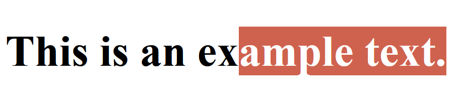
Cross-Browser Compatibility
For better support across older versions of some browsers, include the ::-moz-selection pseudo-element for Firefox:
::selection {
    background: #cf624e;
    color: #ffffff;
}
::-moz-selection {
  background: #cf624e;
  color: #ffffff;
}
You can only style the background and color properties with ::selection. Other properties (like font-size, text-decoration, etc.) are not supported.
Smooth Scrolling
You can achieve smooth scrolling in your web page without using any JavaScript with just a single line of CSS.
html {
  scroll-behavior: smooth;
}
Adding scroll-behavior: smooth; to the HTML element ensures that all anchor links or other in-page navigation (like #section) scroll smoothly to the target section.
Create Smooth and Engaging Effects
CSS transitions allow you to create smooth and engaging effects on your web pages.
These transitions enhance user experience by animating changes instead of having them happen instantly.
A CSS transition occurs when a specified property changes over a defined duration. You can define transitions for properties like colors, dimensions, opacity, and more.
Syntax:
element {
  transition: property duration timing-function delay;
}property: The CSS property to animate (e.g.,color,width,opacity).duration: How long the transition takes (e.g.,2s,500ms).timing-function(optional): Defines the pace of the transition (e.g.,ease,linear,ease-in-out).delay(optional): Time to wait before starting the transition (e.g.,1s).
Changing the Color of Text Cursor
You can change the color of the text cursor of <input> or <textarea> elements, to match your web page color scheme, using the caret-color property.
Example:
<!DOCTYPE html>
<html lang="en">
  <head>
    <meta charset="UTF-8" />
    <meta name="viewport" content="width=device-width, initial-scale=1.0" />
    <title>Changing the Color of Text Cursor</title>
    <style>
      input {
        caret-color: tomato;
      }
    </style>
  </head>
  <body>
    <input type="text" placeholder="Type something here..." />
  </body>
</html>
Browser Support
The caret-color property is supported in modern browsers like Chrome, Firefox, Safari, and Edge, but may not be supported in very old versions.
Controlling Users’ Ability for Text Selection
The user-select property can be used to control the user’s ability to select the text within an element.
Syntax:
element {
  user-select: value;
}value: You have the following values for this property.
auto: Default behavior (allows text selection).none: Disables text selection.text: Allows text to be selected, but this is the default for text-containing elements.contain: Prevents the user from selecting text within the element, but allows selection in its child elements.
Example:
<!DOCTYPE html>
<html lang="en">
  <head>
    <meta charset="UTF-8" />
    <meta name="viewport" content="width=device-width, initial-scale=1.0" />
    <title>Controlling Text Selection</title>
    <style>
      div {
        width: max-content;
        border: 3px solid purple;
        user-select: none; /* Prevents text selection within the div */
      }
    </style>
  </head>
  <body>
    <div>
      <p>You can't select this text.</p>
    </div>
    <p>You can select this text.</p>
  </body>
</html>
Use Case
Some websites may use user-select: none; to protect content from being easily copied (although this is not a foolproof method).
Browser Support
The user-select property is widely supported in modern browsers. However, older versions of Internet Explorer do not support it.
Customize List Points
To customize the list points in CSS, you can use the ::marker pseudo-element.
Example:
<!DOCTYPE html>
<html lang="en">
  <head>
    <meta charset="UTF-8" />
    <meta http-equiv="X-UA-Compatible" content="IE=edge" />
    <meta name="viewport" content="width=device-width, initial-scale=1.0" />
    <title>Customize List Points</title>
    <style>
      ul li::marker {
        content: "★";
        color: gold;
        font-size: 20px;
      }
    </style>
  </head>
  <body>
    <ul>
      <li>Item 1</li>
      <li>Item 2</li>
      <li>Item 3</li>
    </ul>
  </body>
</html>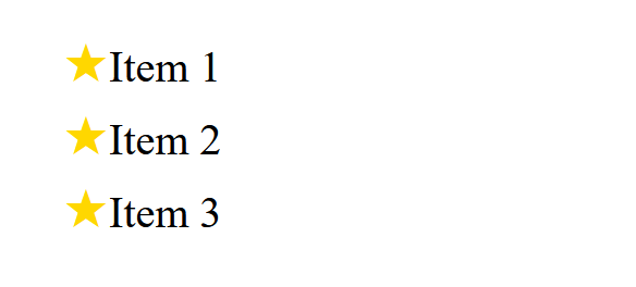
Control Overflowed Text
The text-overflow property in CSS is used to control how overflowed text is handled when it doesn’t fit within the container’s width.
It is particularly useful when you have limited space for text and want to add an ellipsis (...) or some other effect to indicate that the text is too long to be displayed fully.
Example:
<!DOCTYPE html>
<html lang="en">
  <head>
    <meta charset="UTF-8" />
    <meta http-equiv="X-UA-Compatible" content="IE=edge" />
    <meta name="viewport" content="width=device-width, initial-scale=1.0" />
    <title>Text-overflow</title>
    <style>
      div {
        width: 150px;
        border: 1px solid black;
      }
      p {
        white-space: nowrap; /* Prevent text from wrapping onto multiple lines */
        overflow: hidden; /* Hide the overflowed text */
        text-overflow: ellipsis; /* Add ellipsis (...) when the text overflows */
      }
    </style>
  </head>
  <body>
    <div>
      <p>This is an example of CSS text-overflow property.</p>
    </div>
  </body>
</html>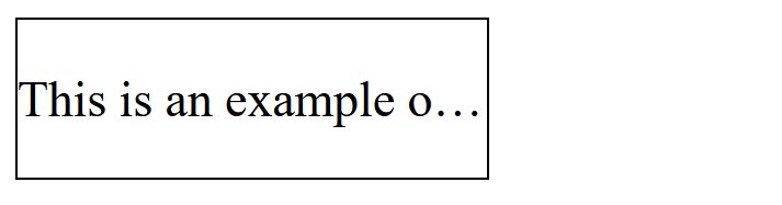
Use Cases for text-overflow
- Navigation bars: In small navigation links where the text may overflow, you can use this to keep the interface clean.
- Text truncation in UI: When you need to truncate long titles, descriptions, or other content while still signaling that there’s more information.
- Responsive design: In designs where the container’s size changes (like when resizing the browser),
text-overflowhelps maintain readability by ensuring text fits within the container.
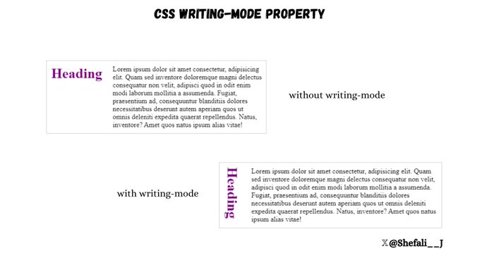
Control the Direction and Flow of Text
The writing-mode property in CSS allows you to control the direction and flow of text in an element.
Values of writing-mode
Example 1: horizontal-tb (default)
It makes the text flow horizontally from left to right and top to bottom.
<!DOCTYPE html>
<html lang="en">
  <head>
    <meta charset="UTF-8" />
    <meta http-equiv="X-UA-Compatible" content="IE=edge" />
    <meta name="viewport" content="width=device-width, initial-scale=1.0" />
    <title>Writing Mode</title>
    <style>
      div {
        display: flex;
        border: 1px solid black;
      }
      h1 {
        color: rgb(119, 50, 119);
        writing-mode: horizontal-tb;
      }
    </style>
  </head>
  <body>
    <div>
      <h1>Heading</h1>
      <p>
        Lorem ipsum dolor sit amet consectetur adipisicing elit. Praesentium
        recusandae reiciendis assumenda quidem ea ducimus doloremque
        necessitatibus exercitationem. Quod commodi alias optio placeat
        explicabo. Omnis facere officiis facilis distinctio veritatis iusto,
        praesentium, incidunt ullam quam earum fugiat? Harum libero officiis
        minima? Itaque ipsam nostrum reiciendis iste nulla. Dicta, voluptatem
        ab?
      </p>
    </div>
  </body>
</html>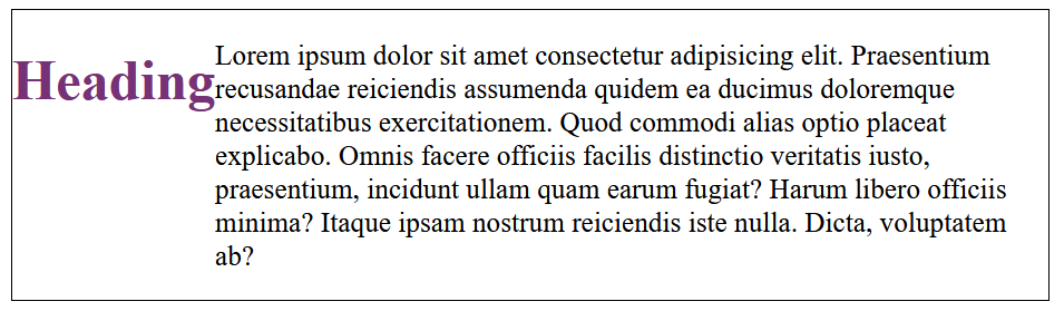
Example 2: sideways-rl
This value rotates the text by 90 degrees counter-clockwise and makes it flow from right to left.
<!DOCTYPE html>
<html lang="en">
  <head>
    <meta charset="UTF-8" />
    <meta http-equiv="X-UA-Compatible" content="IE=edge" />
    <meta name="viewport" content="width=device-width, initial-scale=1.0" />
    <title>Writing Mode</title>
    <style>
      div {
        display: flex;
        border: 1px solid black;
      }
      h1 {
        color: rgb(119, 50, 119);
        writing-mode: sideways-rl;
      }
    </style>
  </head>
  <body>
    <div>
      <h1>Heading</h1>
      <p>
        Lorem ipsum dolor sit amet consectetur adipisicing elit. Praesentium
        recusandae reiciendis assumenda quidem ea ducimus doloremque
        necessitatibus exercitationem. Quod commodi alias optio placeat
        explicabo. Omnis facere officiis facilis distinctio veritatis iusto,
        praesentium, incidunt ullam quam earum fugiat? Harum libero officiis
        minima? Itaque ipsam nostrum reiciendis iste nulla. Dicta, voluptatem
        ab?
      </p>
    </div>
  </body>
</html>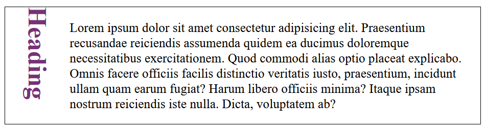
Example 3: sideways-lr
This value rotates the text by 90 degrees clockwise and makes it flow from left to right.
<!DOCTYPE html>
<html lang="en">
  <head>
    <meta charset="UTF-8" />
    <meta http-equiv="X-UA-Compatible" content="IE=edge" />
    <meta name="viewport" content="width=device-width, initial-scale=1.0" />
    <title>Writing Mode</title>
    <style>
      div {
        display: flex;
        border: 1px solid black;
      }
      h1 {
        color: rgb(119, 50, 119);
        writing-mode: sideways-lr;
      }
    </style>
  </head>
  <body>
    <div>
      <h1>Heading</h1>
      <p>
        Lorem ipsum dolor sit amet consectetur adipisicing elit. Praesentium
        recusandae reiciendis assumenda quidem ea ducimus doloremque
        necessitatibus exercitationem. Quod commodi alias optio placeat
        explicabo. Omnis facere officiis facilis distinctio veritatis iusto,
        praesentium, incidunt ullam quam earum fugiat? Harum libero officiis
        minima? Itaque ipsam nostrum reiciendis iste nulla. Dicta, voluptatem
        ab?
      </p>
    </div>
  </body>
</html>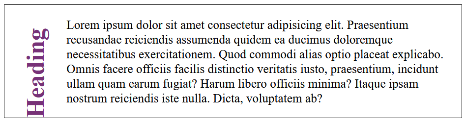
Example 4: vertical-rl
This value makes the text flow vertically from top to bottom, with the lines running from right to left.
<!DOCTYPE html>
<html lang="en">
  <head>
    <meta charset="UTF-8" />
    <meta http-equiv="X-UA-Compatible" content="IE=edge" />
    <meta name="viewport" content="width=device-width, initial-scale=1.0" />
    <title>Writing Mode</title>
    <style>
      div {
        display: flex;
        border: 1px solid black;
      }
      h1 {
        color: rgb(119, 50, 119);
        writing-mode: vertical-rl;
      }
    </style>
  </head>
  <body>
    <div>
      <h1>Heading</h1>
      <p>
        Lorem ipsum dolor sit amet consectetur adipisicing elit. Praesentium
        recusandae reiciendis assumenda quidem ea ducimus doloremque
        necessitatibus exercitationem. Quod commodi alias optio placeat
        explicabo. Omnis facere officiis facilis distinctio veritatis iusto,
        praesentium, incidunt ullam quam earum fugiat? Harum libero officiis
        minima? Itaque ipsam nostrum reiciendis iste nulla. Dicta, voluptatem
        ab?
      </p>
    </div>
  </body>
</html>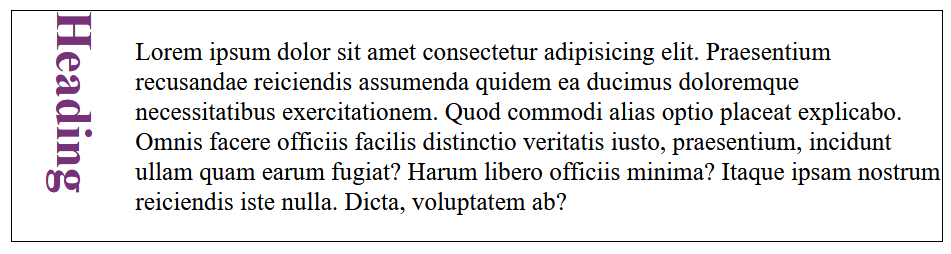
Example 5: vertical-lr
This value makes the text flow vertically from top to bottom, but the lines run from left to right.
<!DOCTYPE html>
<html lang="en">
  <head>
    <meta charset="UTF-8" />
    <meta http-equiv="X-UA-Compatible" content="IE=edge" />
    <meta name="viewport" content="width=device-width, initial-scale=1.0" />
    <title>Writing Mode</title>
    <style>
      div {
        display: flex;
        border: 1px solid black;
      }
      h1 {
        color: rgb(119, 50, 119);
        writing-mode: vertical-lr;
      }
    </style>
  </head>
  <body>
    <div>
      <h1>Heading</h1>
      <p>
        Lorem ipsum dolor sit amet consectetur adipisicing elit. Praesentium
        recusandae reiciendis assumenda quidem ea ducimus doloremque
        necessitatibus exercitationem. Quod commodi alias optio placeat
        explicabo. Omnis facere officiis facilis distinctio veritatis iusto,
        praesentium, incidunt ullam quam earum fugiat? Harum libero officiis
        minima? Itaque ipsam nostrum reiciendis iste nulla. Dicta, voluptatem
        ab?
      </p>
    </div>
  </body>
</html>
Use Cases
- Asian Languages: Many Asian languages like Japanese, Chinese, and Korean traditionally use vertical text flow in certain contexts, especially for writing in columns.
- Design Effects: You can use
writing-modeto create unique text effects, such as vertically rotated text or text that flows in columns.
Limit the Number of Lines in a Block of Text
You can use -webkit-line-clamp property to easily limit the number of lines in a block of text.
It’s especially useful when you want to constrain text within a fixed number of lines without relying on JavaScript.
This property only works when the display property is set to -webkit-box or -webkit-inline-box and the -webkit-box-orient property is set to vertical.

Browser Compatibility
- This property is not part of the official CSS specification but is widely supported in WebKit-based browsers, including Chrome, Edge, Safari, and some mobile browsers.
- For browsers that do not support
-webkit-line-clamp, consider a JavaScript fallback for multi-line truncation.
Control the User’s Ability to Resize an Element
You can use the CSS resize property to control the user’s ability to resize an element. For the resize property to work, the element must have an overflow value.
The resize property is most often used with elements like <textarea> or containers like <div>, with scrollable content.
Syntax:
element {
  resize: none | both | horizontal | vertical;
}
Values for the resize property
none: The user cannot resize the element. The resize handles are hidden.vertical: The user can resize the element vertically only.horizontal: The user can resize the element horizontally only.both: The user can resize the element in both horizontal and vertical directions.
Store Values and Reuse Them
CSS Variables allows you to store values in one place and reuse them throughout your stylesheets. This helps in maintaining consistency and makes your CSS code more manageable and easier to update.
Syntax:
You can define a CSS variable using the -- prefix.
For example:
:root {
  --primary-color: #3498db;
  --secondary-color: #2ecc71;
  --font-size: 16px;
}:root: The:rootselector is where you define global variables. It acts as a global scope for the variables, making them accessible throughout the stylesheet.--primary-color,--secondary-color: These are the CSS variable names. The values are stored and can be reused wherever needed in your stylesheet.
You can then use these variables throughout your CSS:
body {
  font-size: var(--font-size);
  color: var(--primary-color);
}

h1 {
  color: var(--secondary-color);
}- var(–primary-color): This is how you use the CSS variable inside other CSS properties.
Benefits of Using CSS Variables
- Reusability: Once defined, variables can be reused multiple times across your styles, helping avoid repetition.
- Maintainability: If you need to change a value, such as the primary color, you can simply update it in the
:rootselector, and all uses of that variable will automatically be updated. - Flexibility: You can dynamically update CSS variables in JavaScript or use them with media queries to adjust styles based on conditions like screen size or themes.
Change the Default Color of Inputs
You can change the default color of inputs like checkboxes and radio buttons, using accent-color property.
This helps you match the styles with the design of your website.
Example:
<!DOCTYPE html>
<html lang="en">
  <head>
    <meta charset="UTF-8" />
    <meta http-equiv="X-UA-Compatible" content="IE=edge" />
    <meta name="viewport" content="width=device-width, initial-scale=1.0" />
    <title>Default Color of Inputs</title>
    <style>
      input[type="checkbox"] {
        accent-color: #ff6347;
      }
    </style>
  </head>
  <body>
    <label> <input type="checkbox" /> Option 1 </label>
    <label> <input type="checkbox" /> Option 2 </label>
  </body>
</html>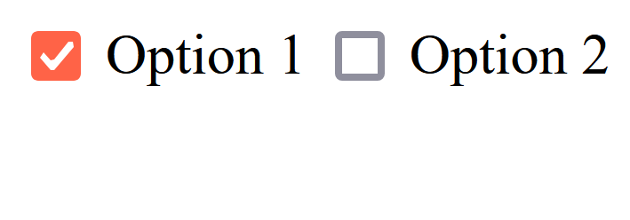
This is especially useful for maintaining a consistent color scheme across form inputs like checkboxes, radio buttons, and range sliders to match your website’s branding to provide a seamless user experience.
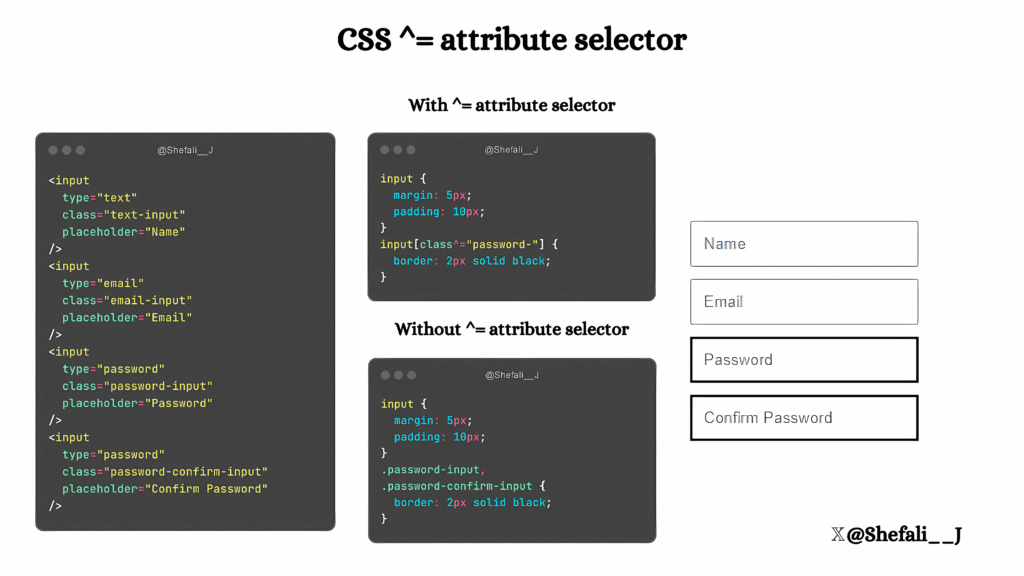
^= Attribute Selector
You can use the ^= attribute selector to select elements where the value of a specified attribute starts with a particular string. This selector is especially useful when working with elements that have dynamic or partial attribute values.
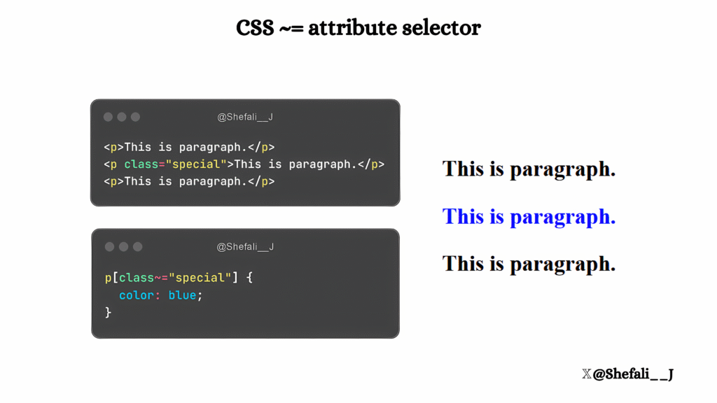
~= Attribute Selector
You can use the ~= attribute selector to select elements where a specified attribute contains a whole word. This is particularly useful for matching elements with space-separated attribute values, such as classes or custom attributes.
The ~= selector matches exact words in space-separated lists. Partial matches (e.g., substrings) won’t work.
Now, you might be thinking what is the difference between ~= selector and selecting the element directly using the class name .special.
So, you can select the elements direct with the class names but this selector is helpful when you want to select elements with attributes other than class or id.
For example, imagine you have several <div> elements, and each <div> has a data-role attribute that can contain multiple roles.
Now, you want to select all elements that include the word admin in their data-role attribute, then the ~= attribute selector can be handy for this.
<div data-role="admin editor">Admin and Editor</div>
<div data-role="admin viewer">Admin and Viewer</div>
<div data-role="viewer">Only Viewer</div>
div[data-role~="admin"] {
  background-color: yellow;
}
Only the first two <div> elements will be styled because their data-role attribute contains “admin” as a word.
:not() CSS selector
You can use the :not() CSS selector to select the elements that do not match a specified selector.
It provides a way to exclude specific elements from a set of selected elements.
Syntax:
selector:not(specific-selector) {
  /* Styles */
}selector: The general selector to which the rule applies.specific-selector: The selector you want to exclude.
Example:
<!DOCTYPE html>
<html lang="en">
  <head>
    <meta charset="UTF-8" />
    <meta name="viewport" content="width=device-width, initial-scale=1.0" />
    <title>:not() CSS Selector</title>
    <style>
      div:not(.unique) {
        background-color: lightblue;
      }
    </style>
  </head>
  <body>
    <div>This will be light blue.</div>
    <div class="unique">This will not be styled.</div>
    <div>Another light blue div.</div>
  </body>
</html>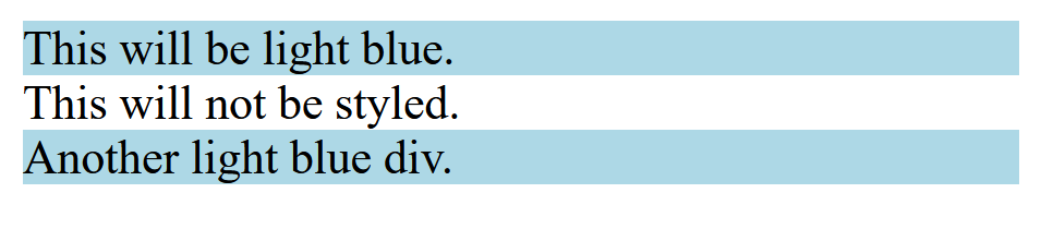
You cannot nest complex selectors like combinators (> or +) inside :not() selector.
:empty pseudo class
You can use the :empty pseudo-class to select elements that do not contain any child elements or text content. This includes whitespace, as even a single space or line break inside the element will cause it to no longer match :empty.
Syntax:
selector:empty {
  /* Styles */
}selector: The element(s) you want to target.
Example:
<!DOCTYPE html>
<html lang="en">
  <head>
    <meta charset="UTF-8" />
    <meta name="viewport" content="width=device-width, initial-scale=1.0" />
    <title>:empty Pseudo-Class</title>
    <style>
      div:empty {
        background-color: lightgray;
        border: 1px solid black;
      }
    </style>
  </head>
  <body>
    <div></div> <!-- Will be styled -->
    <div>Not empty</div> <!-- Will not be styled -->
    <div>  </div> <!-- Will not be styled due to whitespace -->
  </body>
</html>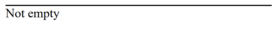
:has() pseudo class
You can use the :has() selector to select an element that contains certain child elements and then apply styles to it.
This allows you to style parent elements conditionally, depending on their children.
Syntax:
selector:has(child-selector) {
  /* Styles */
}selector: The parent element you want to style.child-selector: The child or descendant elements the parent must contain to be selected.
Example 1:
<!DOCTYPE html>
<html lang="en">
  <head>
    <meta charset="UTF-8" />
    <meta name="viewport" content="width=device-width, initial-scale=1.0" />
    <title>:has() Pseudo-Class</title>
    <style>
      .card:has(img) {
        padding: 10px;
        border: 2px solid blue;
      }
    </style>
  </head>
  <body>
    <div class="card">
      <p>No image here.</p>
    </div>
    <div class="card">
      <img src="cat.jpg" alt="Cat Image" />
    </div>
  </body>
</html>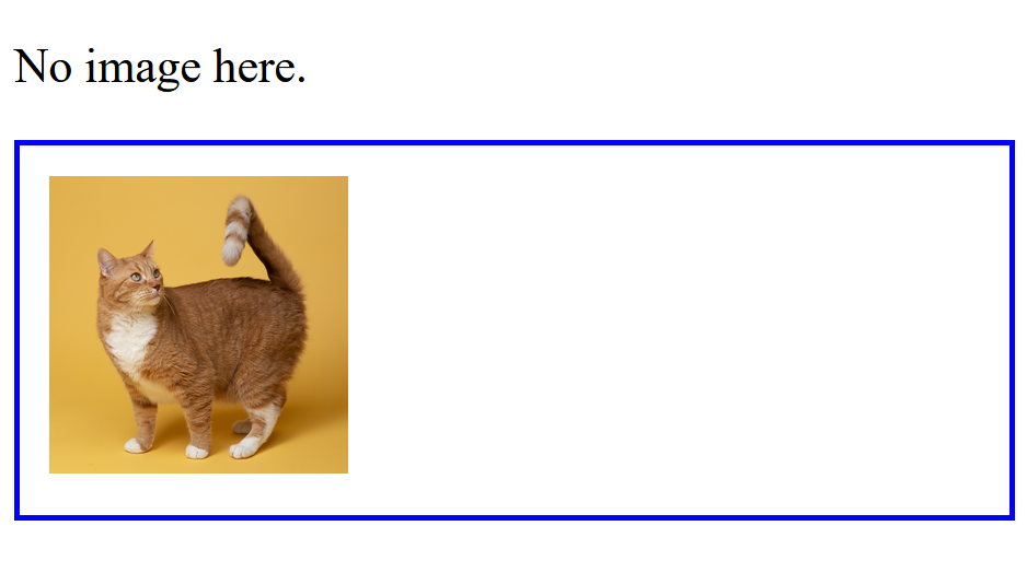
The second <div> will be styled because it contains an <img> element.
Example 2:
<!DOCTYPE html>
<html lang="en">
  <head>
    <meta charset="UTF-8" />
    <meta name="viewport" content="width=device-width, initial-scale=1.0" />
    <title>:has() Pseudo-Class</title>
    <style>
      ul:has(li.special) {
        background-color: tomato;
      }
    </style>
  </head>
  <body>
    <ul>
      <li>Item 1</li>
      <li>Item 2</li>
    </ul>
    <ul>
      <li class="special">Special Item</li>
    </ul>
  </body>
</html>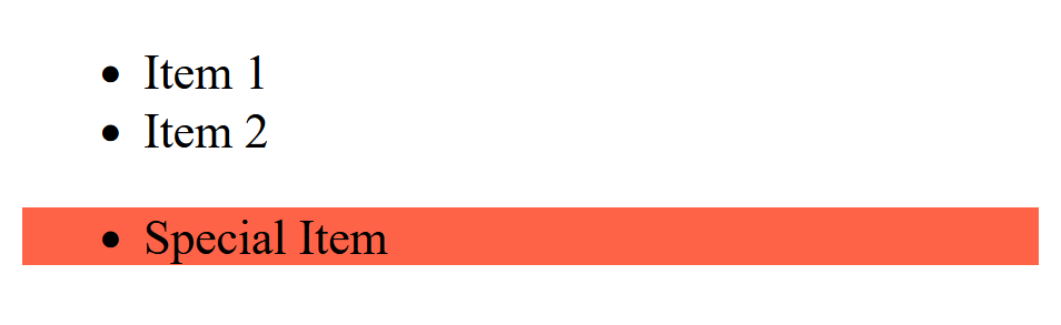
The second <ul> will be styled because it contains a <li> with the class special.
Browser Support
As of now, :has() is supported in modern browsers like Chrome, Edge, and Safari, but older versions or some browsers may not support it fully.
Performance
Since :has() allows parent element styling based on children, it can be computationally heavy for large DOM trees. To keep your site fast, use :has() only when really needed.
That’s all for today!
I hope these CSS tips help you to enhance your UI design!
If you’re new to web development, check out Learnify — my curated platform with beginner-friendly tutorials to help you learn web development step-by-step with examples and simple explanations.
If you enjoy my work and want to support what I do buy me a coffee!
Every small gesture keeps me going! 💛
Follow me on X (Twitter) to get daily web development tips & insights.
Enjoyed reading? You may also find these articles helpful.
14 CSS Generators That Will Save You Hours of Coding
5 Websites Every CSS Developer Should Know
Great insights! This really gave me a new perspective. Thanks for sharing.
You have remarked very interesting points! ps decent website.
Hi my friend! I want to say that this article is awesome, great written and include approximately all vital infos. I’d like to see more posts like this.