CSS has evolved a lot in the last few years.
Many things that once needed JavaScript, extra libraries, or messy hacks can now be done with just a few lines of CSS.
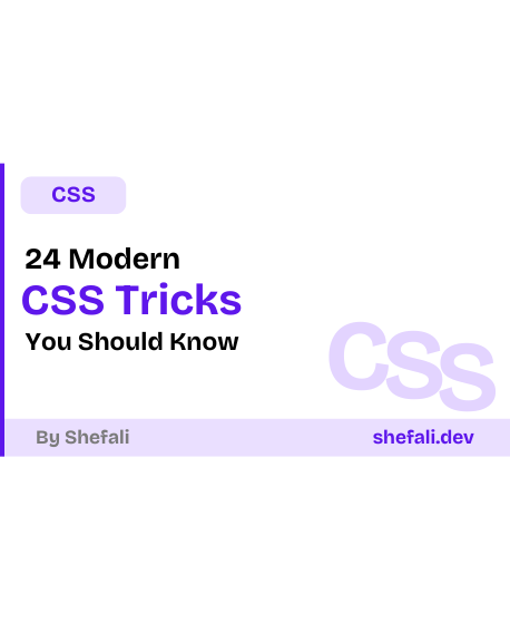
In this post, I’ll share 24 modern CSS tricks that can help you build cleaner layouts, write less code, and create better user experiences.
Now, let’s jump right into it!
1. :has() — The Parent Selector
For years, CSS couldn’t style a parent based on its children. The :has() pseudo-class finally fixes that.
/* Style a card only if it contains an image */
.card:has(img) {
  border: 1px solid #7c3aed;
}
In this example, the card gets a border only when it contains an <img> element.
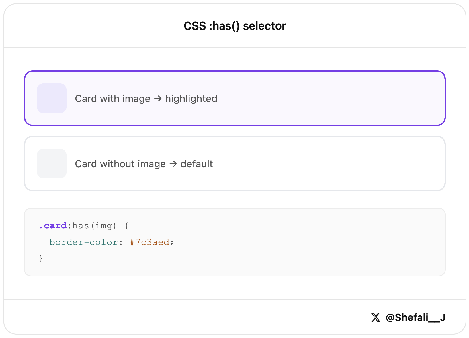
Before :has(), this often required JavaScript. Now you can handle many of these cases with CSS alone.
2. aspect-ratio — Keep Elements Proportional
The aspect-ratio property lets you easily set a width-to-height ratio for an element.
.thumbnail {
  aspect-ratio: 16 / 9;
  object-fit: cover;
}
In this example, the thumbnail will always maintain a 16:9 ratio, no matter its size.
This is especially useful for images, videos, and cards where you want a consistent shape without extra CSS tricks.
3. gap in Flexbox
The gap property lets you add space between flex items without using margins.
.flex-container {
  display: flex;
  gap: 16px;
}
gap only adds space between items, not around the whole container.
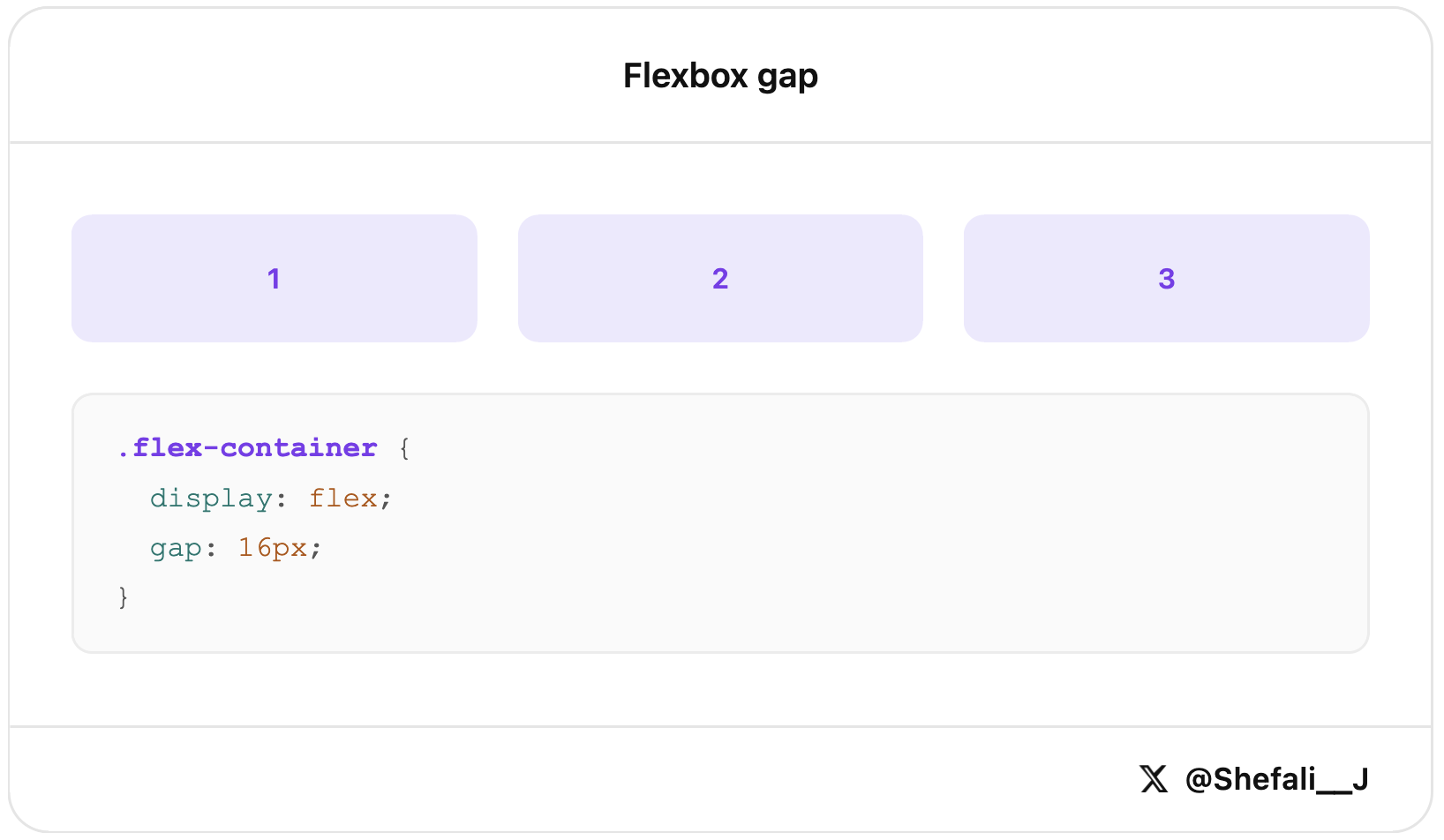
It’s a cleaner and simpler way to create spacing in flex layouts, especially for navigation menus, button groups, and card layouts.
4. clamp() for Responsive Typography
The clamp() function lets you create font sizes that automatically adjust to the screen size.
Learn more about CSS clamp()!
h1 {
  font-size: clamp(1.5rem, 4vw, 3rem);
}
In this example, the heading size grows and shrinks with the viewport, but it will never be smaller than 1.5rem or larger than 3rem.
This is a great way to make text responsive without writing multiple media queries.
5. Container Queries
Container queries let you style an element based on the size of its parent container instead of the screen size.
Learn more about container queries!
.card-container {
  container-type: inline-size;
}

@container (min-width: 400px) {
  .card {
    flex-direction: row;
  }
}
In this example, the card switches to a horizontal layout when its container becomes wider than 400px.
This makes components more flexible and reusable because they can adapt to the space available to them, regardless of the viewport size.
6. :is() and :where() for Cleaner Selectors
The :is() and :where() pseudo-classes help you write shorter and more readable CSS by grouping selectors together.
/* Instead of this */
header h1, header h2, footer h1, footer h2 { color: #111; }

/* Do this */
:is(header, footer) :is(h1, h2) { color: #111; }
This gives the same result but with much less code.
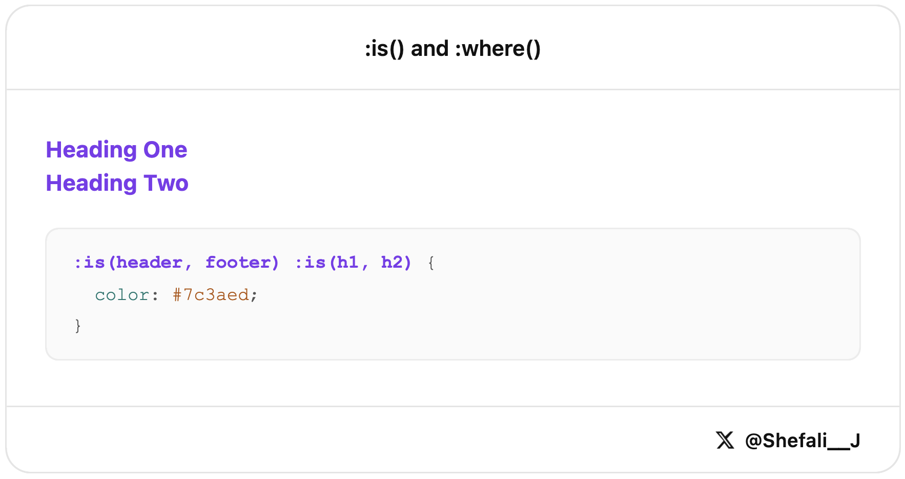
The :where() selector works similarly, but it doesn’t add any specificity. This makes it useful when you want to keep your CSS easy to override later.
7. Native CSS Nesting
CSS now supports nesting, so you can write related styles together without needing Sass.
.card {
  padding: 16px;

  &:hover {
    box-shadow: 0 4px 12px rgba(0,0,0,0.1);
  }

  .title {
    font-weight: 700;
  }
}
This keeps your styles more organised and easier to read by grouping related selectors in one place.
It’s especially useful for components with multiple states and child elements.
8. :focus-visible for Better Focus States
The :focus-visible pseudo-class lets you show focus styles only when they’re actually needed, such as when users navigate with the keyboard.
button:focus-visible {
  outline: 3px solid #7c3aed;
  outline-offset: 2px;
}
In this example, the focus outline appears during keyboard navigation but won’t show up every time the button is clicked with a mouse.
This improves accessibility while keeping the interface clean and less distracting.
9. scroll-snap for Carousels Without JavaScript
The scroll-snap properties help you create carousels and scrollable sections that automatically snap into place while scrolling.
.carousel {
  display: flex;
  overflow-x: auto;
  scroll-snap-type: x mandatory;
}

.carousel-item {
  scroll-snap-align: start;
}
In this example, each item snaps neatly into position as the user scrolls through the carousel.
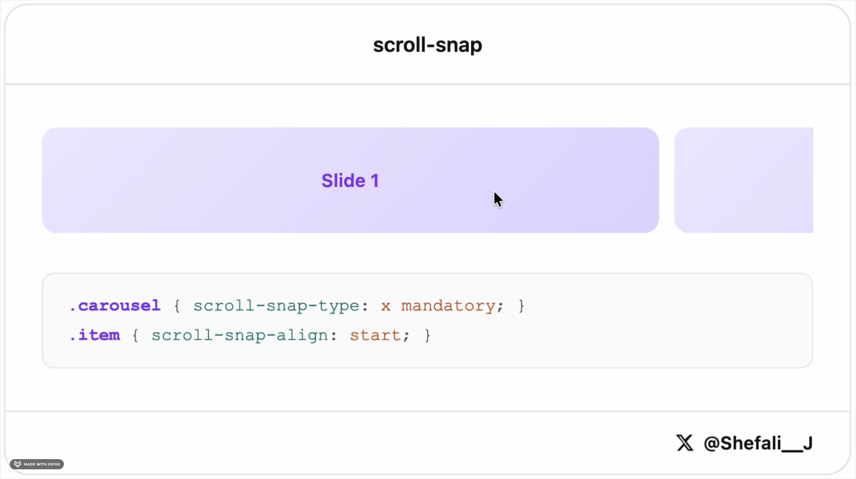
This is a simple way to build smooth, touch-friendly carousels and horizontal galleries without relying on JavaScript libraries.
10. gap in Grid for Equal Spacing
The gap property makes it easy to add consistent spacing between items in a grid layout.
.grid {
  display: grid;
  grid-template-columns: repeat(3, 1fr);
  gap: 20px;
}
In this example, there will be 20px of space between all rows and columns in the grid.
You can also use row-gap and column-gap separately if you need different values.
It’s a clean and simple way to manage spacing without adding margins to individual grid items.
11. :not() with Multiple Selectors
The :not() pseudo-class lets you exclude specific elements from a CSS rule.
li:not(.active, .disabled) {
  opacity: 0.7;
}
In this example, the style is applied to all list items except those with the .active or .disabled class.
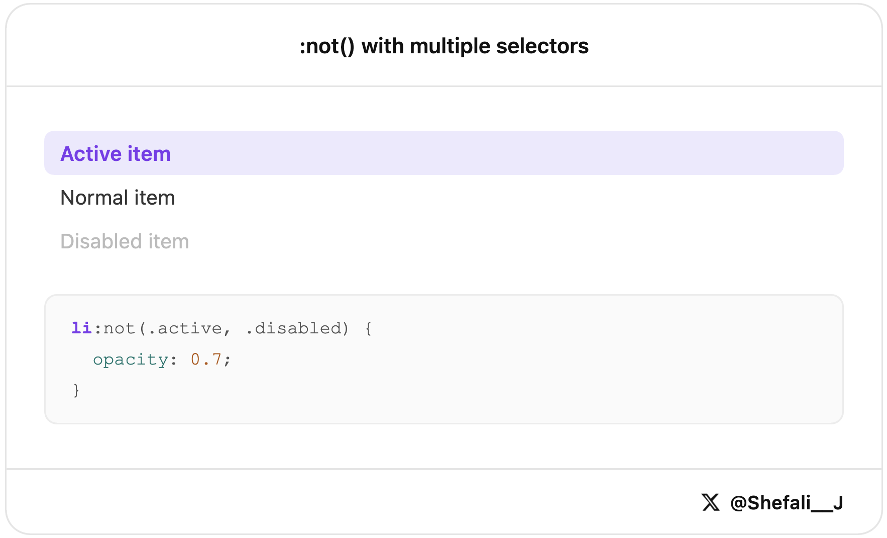
This makes your selectors shorter and easier to read compared to writing multiple :not() conditions.
12. backdrop-filter for Glassmorphism Effects
The backdrop-filter property lets you apply visual effects, such as blur, to the area behind an element.
.modal-overlay {
  backdrop-filter: blur(10px);
  background: rgba(255, 255, 255, 0.6);
}
In this example, the content behind the overlay is blurred, creating a frosted glass effect.
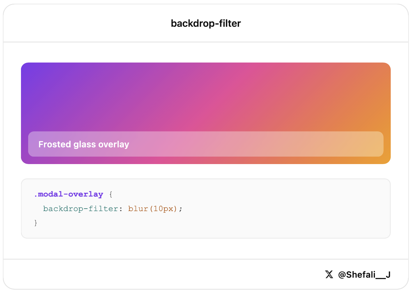
This is commonly used in modals, navigation bars, and side panels to create a modern and polished user interface.
13. text-wrap: balance for Better Headlines
The text-wrap: balance property helps create more evenly balanced line breaks in headings and short blocks of text.
h1 {
  text-wrap: balance;
}
In this example, the browser automatically adjusts how the text wraps, making the heading look more balanced and easier to read.
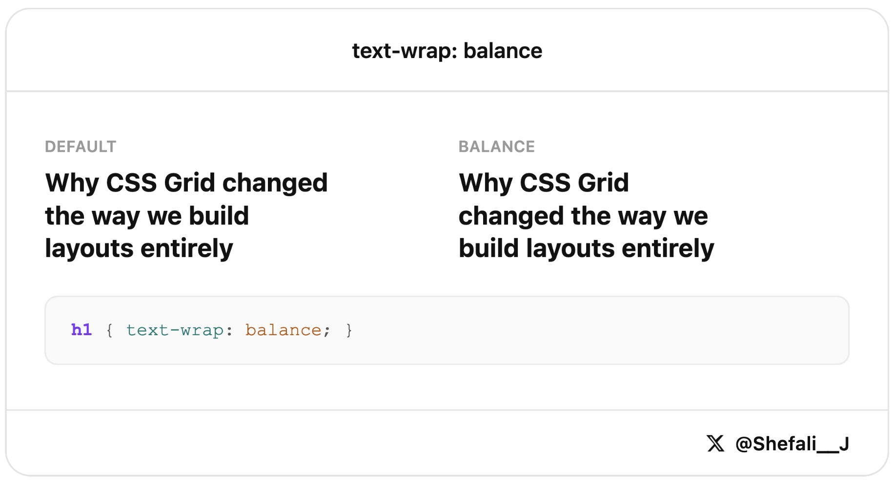
This is especially useful for large headings where a single word might otherwise end up alone on the last line.
14. :empty for Empty Elements
The :empty pseudo-class targets elements that don’t contain any content.
.badge:empty {
  display: none;
}
In this example, the badge is automatically hidden when it has no content.
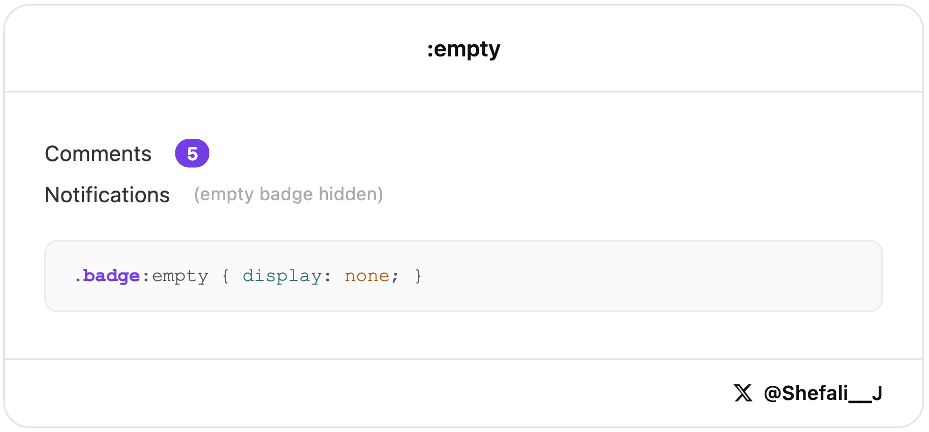
This is useful for badges, notifications, comments, or other UI elements that shouldn’t appear when there’s nothing to display.
15. @layer for Better CSS Organisation
The @layer rule lets you organise your CSS into layers and control which styles take priority.
@layer base, components, utilities;

@layer base {
  button { padding: 8px; }
}

@layer utilities {
  .p-0 { padding: 0; }
}
In this example, styles in the utilities layer can override styles in the base layer, even if the selectors are simpler.
This helps keep large stylesheets organised and makes it easier to avoid CSS specificity issues.
16. :nth-child() for Pattern-Based Styling
The :nth-child() pseudo-class lets you style elements based on their position within a parent element.
tr:nth-child(even) {
  background: #f9fafb;
}

li:nth-child(3n) {
  color: #7c3aed;
}
In this example, every even table row gets a different background color, and every third list item gets a purple text color.
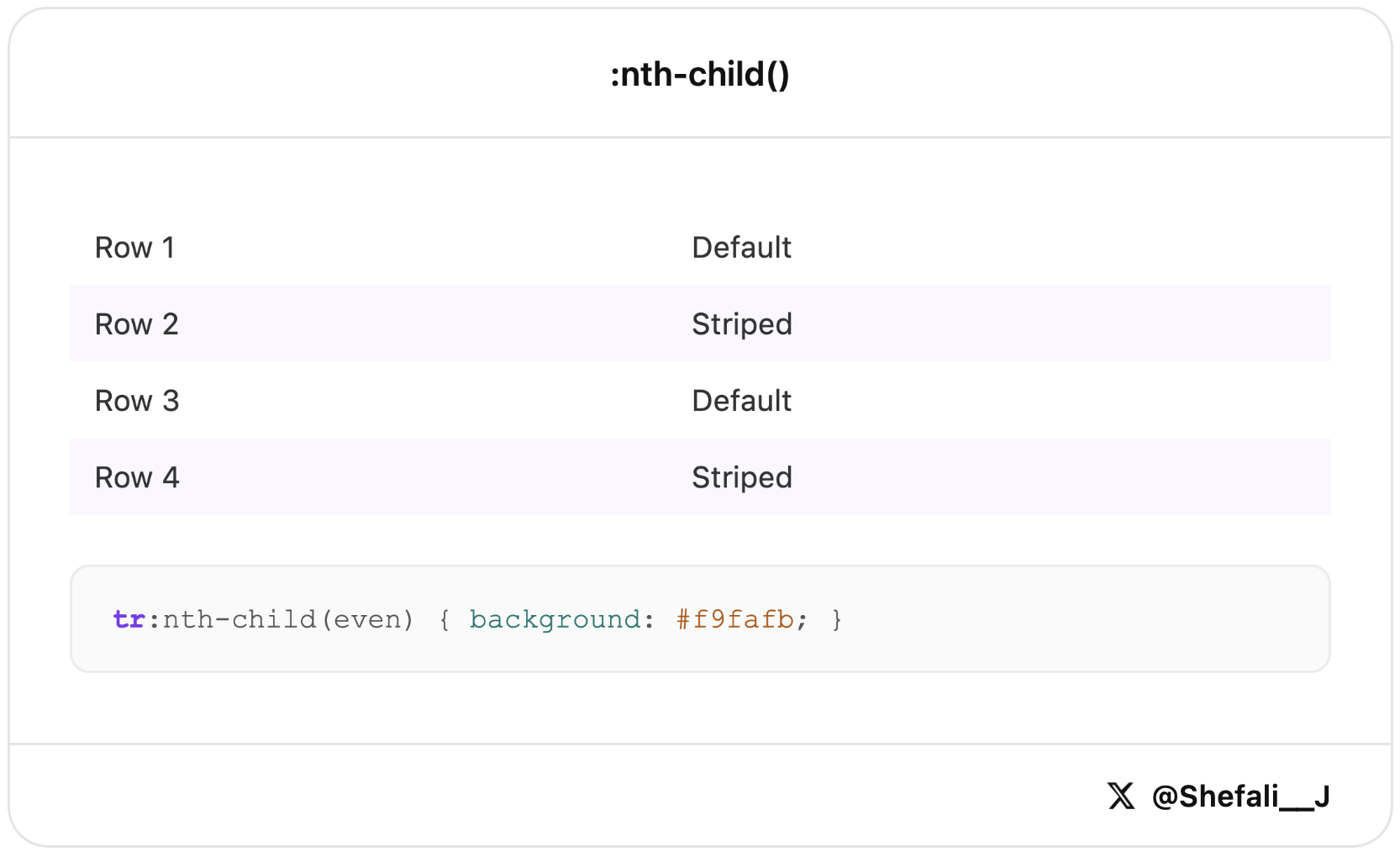
This is useful for striped tables, alternating layouts, and other repeating design patterns without adding extra classes to your HTML.
17. currentColor for Matching Text and Icons
The currentColor keyword lets an element use the current value of the color property.
.icon {
  fill: currentColor;
  color: #7c3aed;
}
In this example, the SVG icon automatically uses the same color as the text.
This makes it easy to keep icons and text in sync, especially when working with themes, hover states, or dark mode.
18. overflow-wrap for Preventing Text Overflow
Long URLs, email addresses, or other unbroken text can sometimes overflow their container and break a layout.
.text-content {
  overflow-wrap: break-word;
}
In this example, long words will automatically wrap onto the next line when needed.
This helps keep your layouts responsive and prevents content from spilling outside its container.
19. prefers-color-scheme for Automatic Dark Mode
The prefers-color-scheme media query lets you apply dark mode styles based on the user’s system settings.
@media (prefers-color-scheme: dark) {
  body {
    background: #0f0f0f;c
    color: #f5f5f5;
  }
}
In this example, users who have dark mode enabled on their device will automatically see the dark theme.
This is an easy way to support dark mode and provide a better user experience without using JavaScript.
20. color-mix() for Creating Color Variations
The color-mix() function lets you blend two colors directly in CSS.
.button-hover {
  background: color-mix(in srgb, #7c3aed 80%, white);
}
In this example, the background color is created by mixing 80% purple with 20% white, resulting in a lighter shade.
This is useful for creating hover states, tints, and color variations without manually calculating and storing extra color values.
21. :user-valid and :user-invalid for Better Form Validation
The :user-valid and :user-invalid pseudo-classes let you show validation styles only after a user has interacted with a form field.
input:user-invalid {
  border-color: #dc2626;c
}

input:user-valid {
  border-color: #16a34a;
}
In this example, invalid fields get a red border and valid fields get a green border, but only after the user has entered or changed a value.
This creates a better user experience by avoiding validation errors on fields that haven’t been touched yet.
22. @property for Animating CSS Variables
The @property rule lets you define a custom CSS property and make it animatable.
@property --angle {
  syntax: '<angle>';
  initial-value: 0deg;
  inherits: false;
}

.gradient-box {
  background: conic-gradient(from var(--angle), #7c3aed, #ec4899);
  transition: --angle 0.6s ease;
}

.gradient-box:hover {
  --angle: 180deg;
}
In this example, the --angle variable smoothly changes when the element is hovered, creating an animated gradient effect.
This makes it possible to build advanced animations with CSS variables that previously required JavaScript.
23. :placeholder-shown for Floating Labels Without JavaScript
The :placeholder-shown pseudo-class lets you style an input differently when its placeholder text is visible.
input:not(:placeholder-shown) + label {c
  transform: translateY(-20px) scale(0.8);
}
In this example, the label moves up when the user starts typing and the placeholder is no longer visible.
This is a simple way to create floating label inputs using only CSS, without needing JavaScript.
24. overscroll-behavior to Control Scrolling
The overscroll-behavior property lets you control what happens when a user reaches the end of a scrollable area.
.modal-content {
  overscroll-behavior: contain;
}
In this example, scrolling stays inside the modal even when the user reaches the top or bottom of its content.
This helps create a smoother user experience in modals, sidebars, dropdowns, and other scrollable components.
That’s all for today!
I hope these CSS tricks help you write cleaner, more modern CSS.
If you enjoy my work and want to support what I do, buy me a coffee!
Every small gesture keeps me going! 💛
Follow me on X (Twitter) to get daily web development tips & insights.
Enjoyed reading? You may also find these articles helpful.
CSS Media Queries: Beginner’s Guide For Responsive Website